Sopot unveils new visual identity: a seaside city reframing its brand
Sopot, the smallest city in the Tricity metropolitan area yet one of Poland’s most recognisable Baltic resorts, has unveiled a new visual identity system. Far more than a logo refresh, the initiative represents a strategic shift in how the city communicates with residents, visitors and external stakeholders. For a seaside city operating at the intersection of tourism, culture and services, coherent branding has become a key development tool.
marine lifestyle pomerania tricity marine tourism and recreation news17 december 2025 | 07:07 | Source: Gazeta Morska | Prepared by: Kamil Kusier | Print
fot. Sopot
From a logo to an integrated system
The previous Sopot logo, in use since 2004, reflected the visual language of its time. While effective for years, it no longer matched the complexity and scale of the city’s contemporary communication needs. The new identity moves decisively away from a single promotional mark towards a flexible, city-wide visual system.
The system includes:
- a new city logo and sub-brands for municipal institutions,
- a bespoke typeface,
- a restrained colour palette inspired by the coastal landscape,
- illustrative and graphic elements designed for both print and digital use.
This approach aligns Sopot with international best practice, particularly among European port cities and seaside resorts where place branding is increasingly treated as a governance instrument rather than a marketing accessory.
Coastal identity without literal symbols
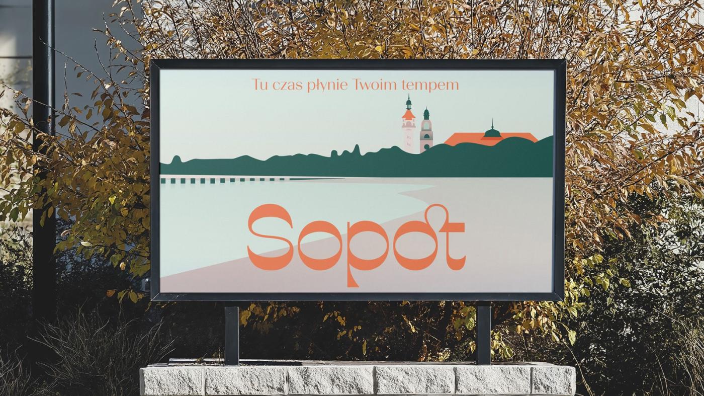
Notably, the new identity avoids overt maritime clichés such as waves or seagulls. Instead, it translates the seaside character into a visual language of rhythm, calm and understated elegance. These qualities have long defined Sopot’s image as a high-quality resort and health destination, and they resonate with contemporary expectations of sustainable, human-scale urban environments.
The accompanying tagline — “Here, time moves at your pace” — reinforces this narrative, positioning Sopot as a city that values balance, well-being and quality of life, while remaining firmly rooted in its coastal context.
Strategic value for the city and the region
From an industry perspective, the significance of Sopot’s new visual identity extends well beyond aesthetics. A coherent branding system:
- strengthens the city’s long-term brand management,
- improves clarity and consistency across municipal communication,
- enhances legibility in public space,
- supports Sopot’s competitive positioning among Baltic Sea destinations.
Importantly, the city’s historic coat of arms remains unchanged. The new identity operates alongside traditional symbols, serving everyday communication needs without displacing heritage.
Evolution rather than disruption
The implementation strategy also reflects a pragmatic approach. Existing materials and signage will be replaced gradually, as they reach the end of their lifecycle. This limits costs and aligns the rebranding process with principles of sustainability and responsible public spending.
Sopot’s new visual identity should be seen as part of a broader trend among coastal cities professionalising their approach to place branding. In an increasingly competitive regional landscape, a city’s visual language is no longer cosmetic — it is an element of its development infrastructure, on par with transport, public space and cultural assets.
For Sopot, the rebrand marks another step towards positioning itself as a modern seaside city that successfully reconciles tradition with the demands of the 21st century.
Buy us a coffee, and we’ll invest in great maritime journalism! Support Gazeta Morska and help us sail forward – click here!
Kamil Kusier
redaktor naczelny
comments
Add the first comment
see also
Winter on Puck Bay: ice conditions, natural values, and responsible use
A crisp and frosty Christmas morning in Ustka
Four medals for Poland at the World Sailing Youth World Championships
Kuyavian-Pomeranian Sailing School to Launch with €3.5 Million Training Vessel
Poland’s Kamil Manowiecki seals dominant win at WingFoil Racing World Cup Finals in Brazil
Polish crew dominates RS Venture: World Sailing gold for the white-and-red team
Beka nature reserve: protecting coastal heritage with support from WFOŚiGW Gdańsk
First Commander Maciej Janiak Award presented aboard ORP Błyskawica
Paweł Tarnowski finishes just off the podium, Anastasiya Valkevich’s bid halted by late capsize - recap of the iQFO
Gdynia marks its centenary. A port city that shaped Poland’s maritime future
ADVERTISEMENT
ADVERTISEMENT